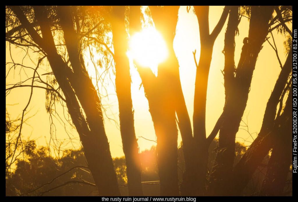
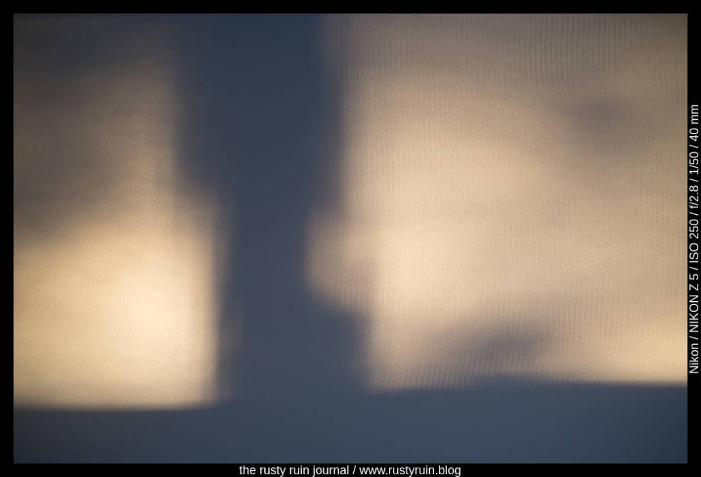
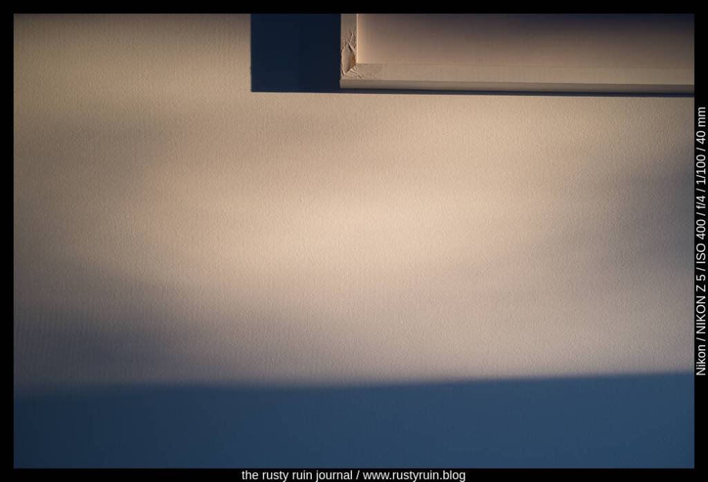
There’s a common view that blowing out or burning highlights is a bad practice. There are times when a lack of detail in areas of a photo due to burnt highlights is problematic if the details in those areas are integral to the feel and story the photo communicates. There are also times when it doesn’t matter at all. For example, is it important to see the filament in a light bulb? And forget about any detail in a bright light source like the sun – that’s not going to happen without special expensive filters.
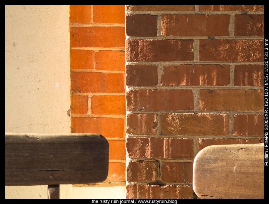
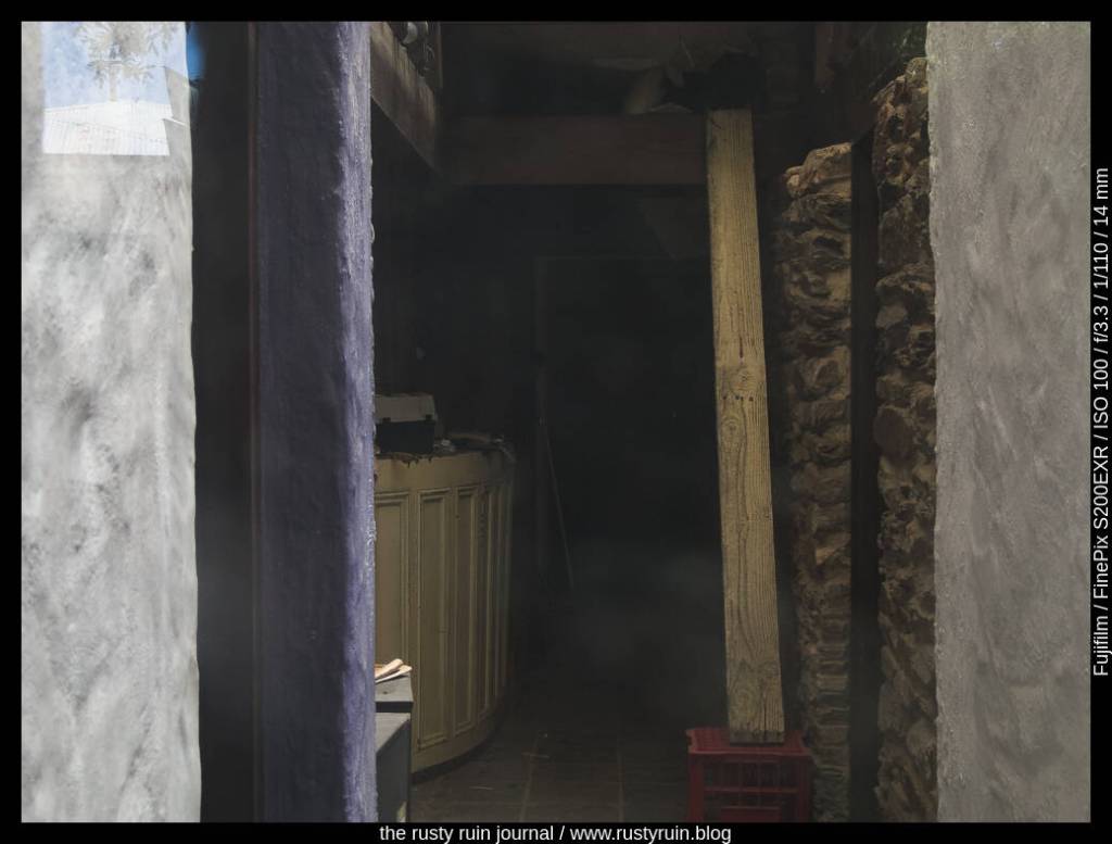
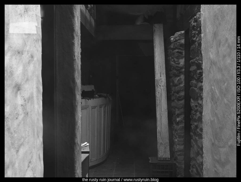
Consider the above photo. To reveal some of the wood grain detail on the leftmost chair, I bumped up the exposure a touch and allowed more light to hit the sensor. Doing this also burnt the highlights on the edges of some bricks. The tradeoff was worth it because it was more important to reveal detail on the chair than to preserve the texture on those small sections of the bricks. The other benefit is that the slightly overexposed highlights also communicate the glow of the sun at the time.
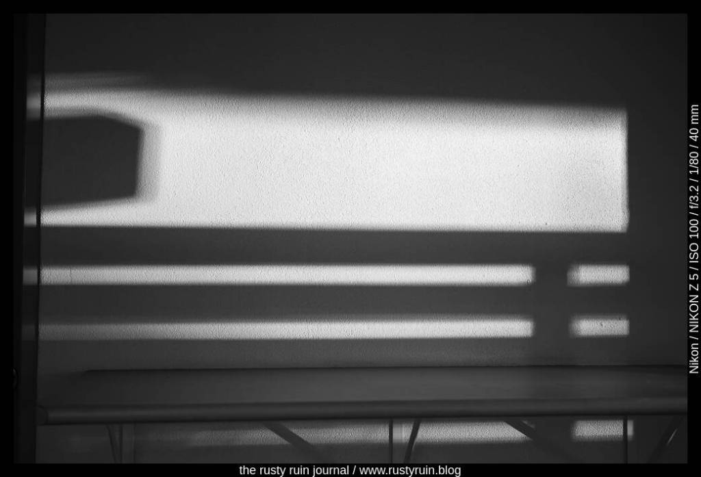
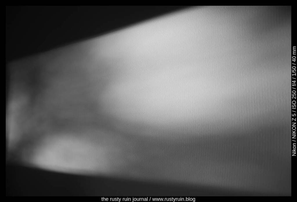
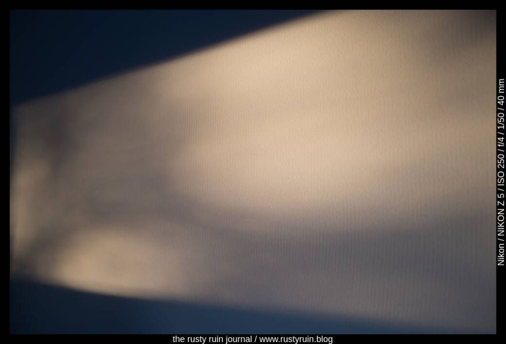
But I think the image works better in black and white:
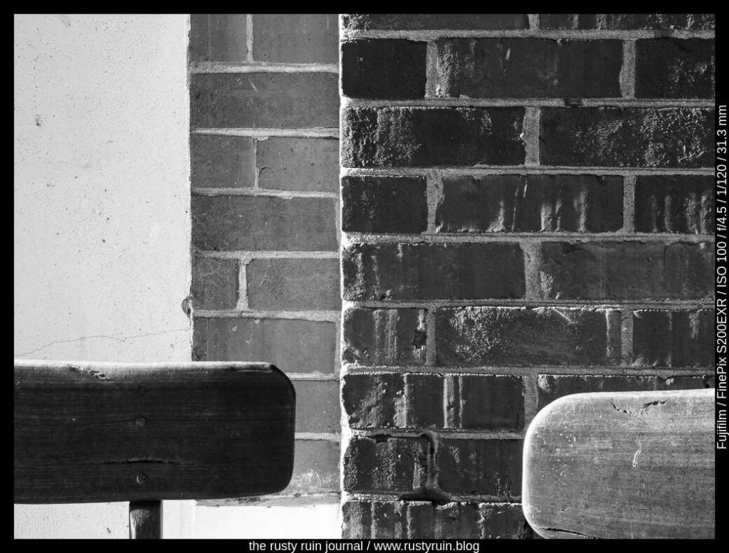
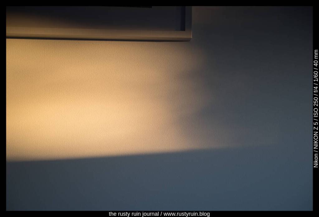
I messed with the tone curve sliders some more and altered levels: shadows, darks, and lights. This produced a final image where the tonal and textural contrast is emphasised – three levels of tonal range from left to right, and several different textures. This is where a black and white conversion pares down a photo to light and shadow, texture and detail. In the world of black and white, the problem of blocked shadows and burnt highlights matters far less, as this type of extreme contrast performs the visual communication often required when colour is absent.