In my previous post, I touched on the idea that gear limitations can have an impact on subject matter and aesthetic choices. Rather than work against the glass, it’s personally more rewarding to adapt to limits and consider other ways to make interesting photos. In this context, limits drive creative growth and learning.
As there was an abundance of wondrous mountains draped in heavy clouds, I made a decision to focus on the scale, shape, colour, and tonality of the landscape rather than the sharpest details. Knowing the optical limits of my telephoto lens changed my perspective.

Distant landscapes are often hazy, and the details are difficult to record. Conditions were also overcast and regularly dull, further encouraging me to adapt and make deliberate aesthetic choices.
My objective in this mountain series was to simply focus on framing form, shape, scale, and tone. Having a rough final image in mind, I made photographs that provided me the raw material for editing post-holiday.

I set the White Balance to Fluorescent in Lightroom to make everything cold and slightly mysterious, emphasising the cloudy conditions. The 16:9 ratio crop choice also amplifies the scale of the mountains and encourages the viewer’s eye to travel their length, taking in tone, layering, and form.
During initial composition for the above photo, I deliberately framed it so the three visible mountain layers travelled to the right edge of the frame and terminated together. This provides visual interest, harmonises with the bulky layering at the leftmost edge of the frame, and serves as both entry and exit point for the viewer’s eye.
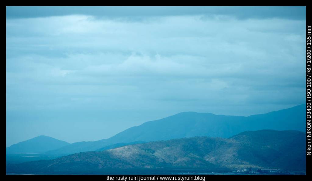
In the photo above, you can just make out tiny white buildings at the bottom right of the frame, They sit at the foot of the mountains and look small, thus providing a sense of scale. I also like the dapples of sunlight near them, made muddy and indistinct by the Fluorescent White Balance choice.