Burnt highlights and textured bricks

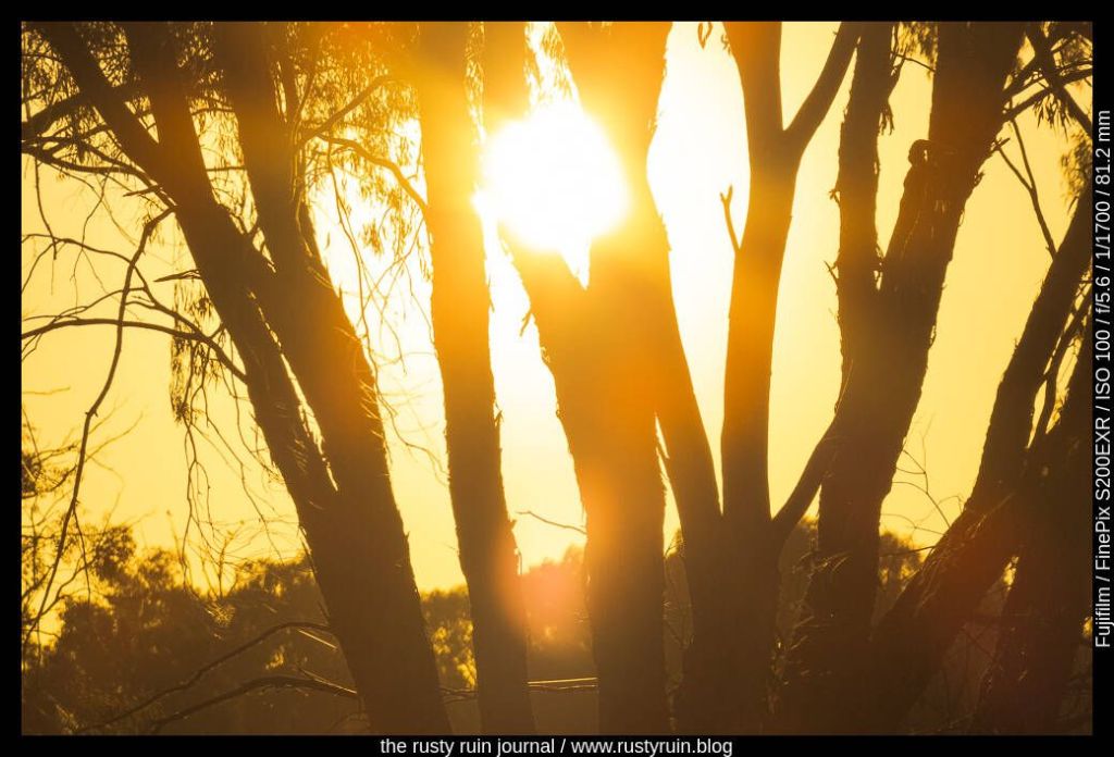
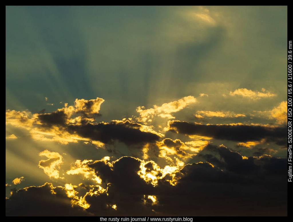
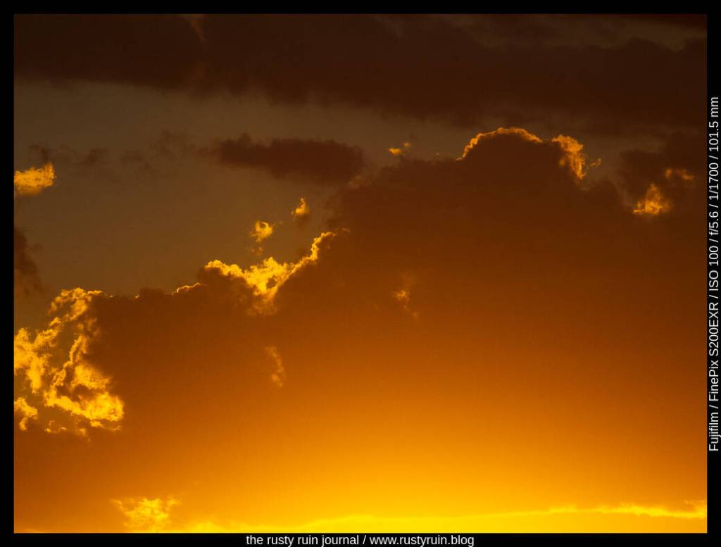
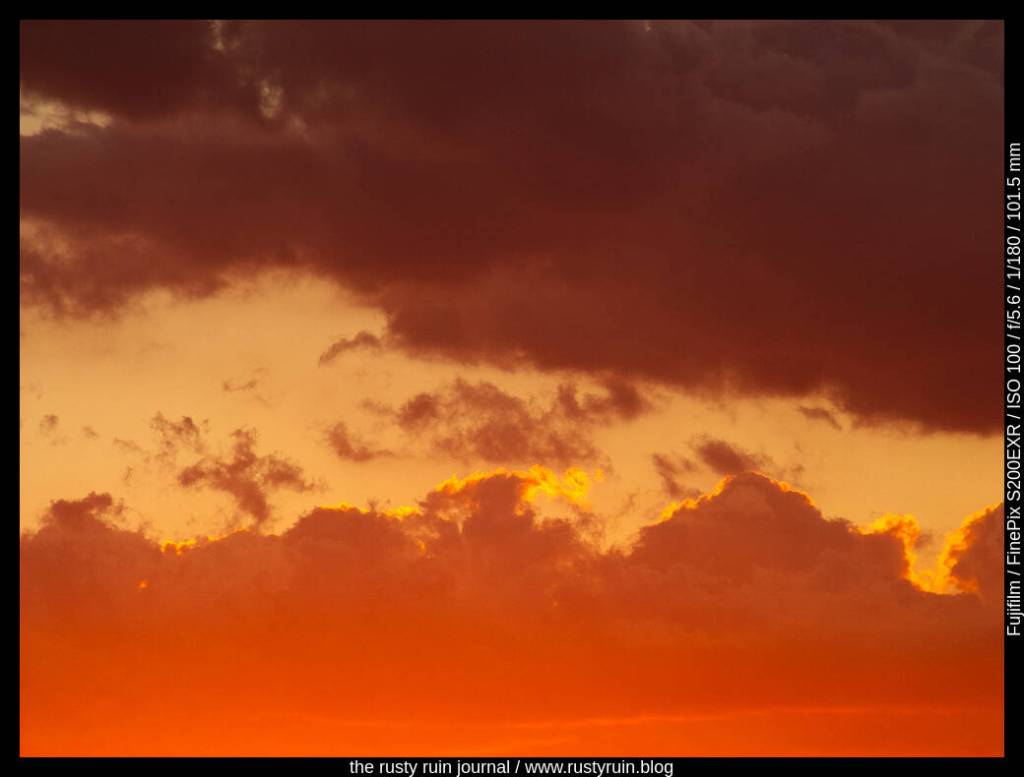
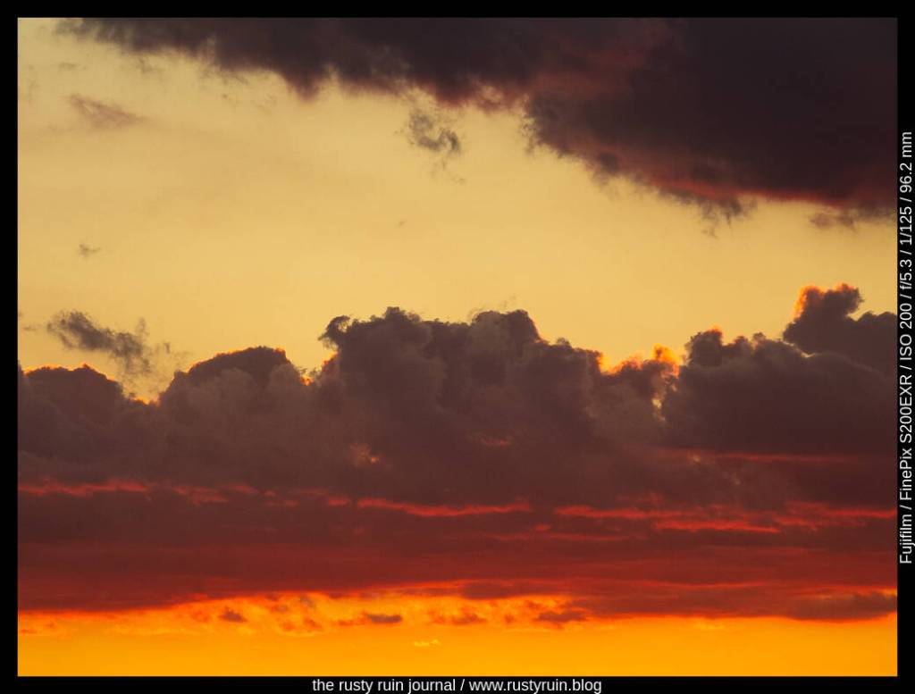
There’s a common view that blowing out or burning highlights is a bad practice. There are times when a lack of detail in areas of a photo due to burnt highlights is problematic if the details in those areas are integral to the feel and story the photo communicates. There are also times when it doesn’t matter at all. For example, is it important to see the filament in a light bulb? And forget about any detail in a bright light source like the sun – that’s not going to happen without special expensive filters.

Sunset glow on wood chairs and bricks – Finepix S200 EXR

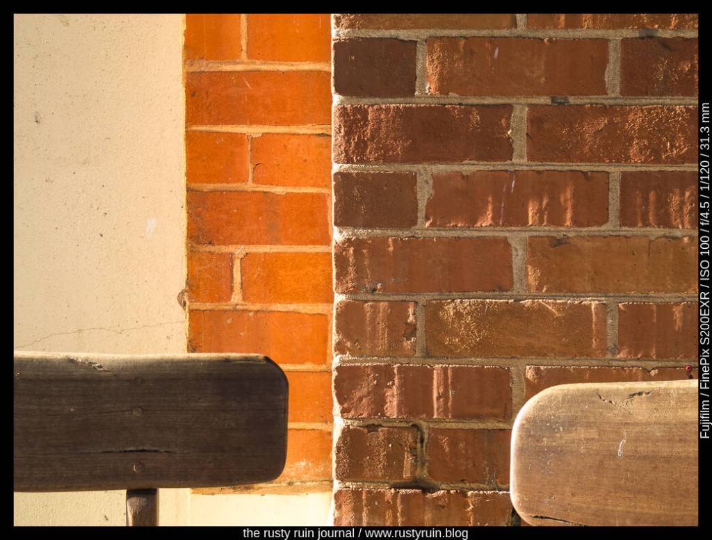
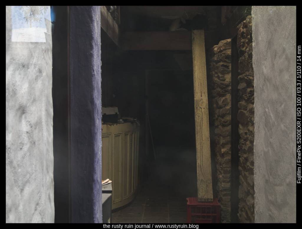
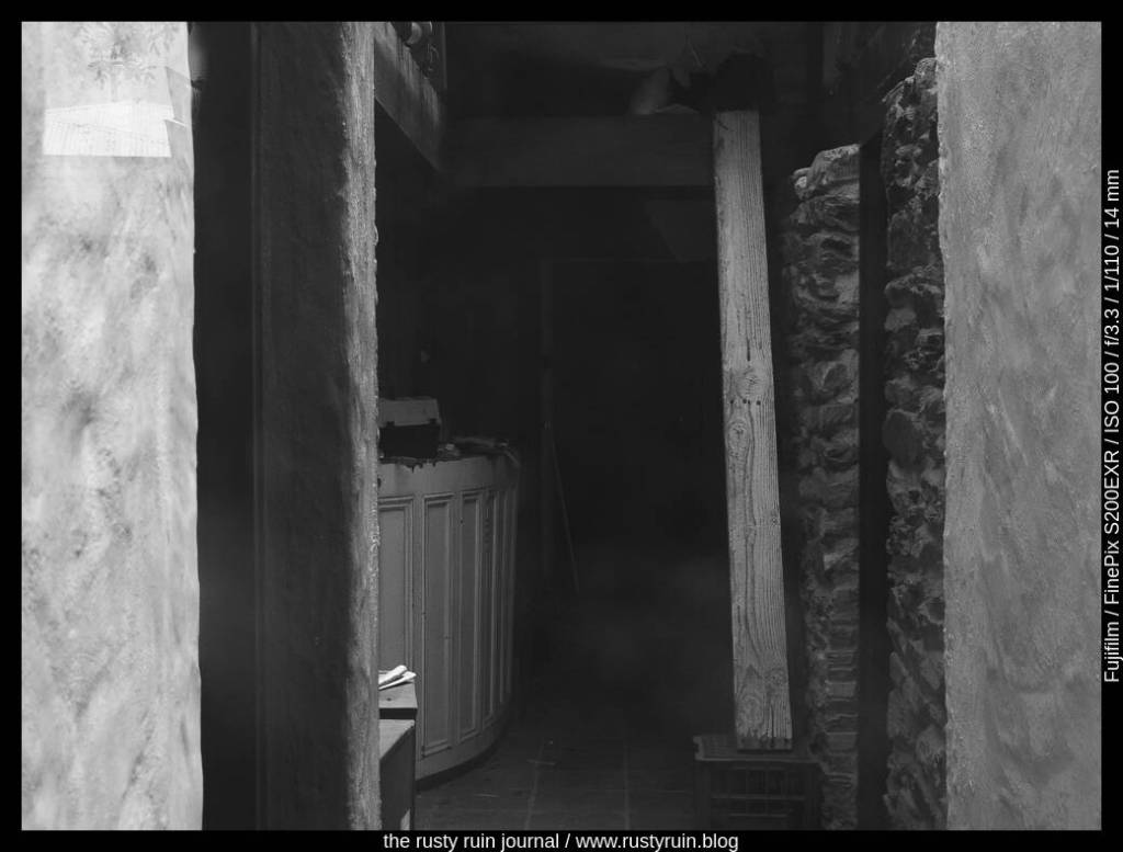
Consider the above photo. To reveal some of the wood grain detail on the leftmost chair, I bumped up the exposure a touch and allowed more light to hit the sensor. Doing this also burnt the highlights on the edge of some of the bricks. The tradeoff was worth it because it was more important to reveal detail on the chair than to preserve the texture on those small sections of the bricks. The other benefit is that the slightly overexposed highlights also communicate the glow of the sun at the time.

The setting sun through trees – light, shape, colour and photographic intent

Driving around to find a good vantage point for the sunset, I spotted a group of trees arranged attractively. It was a quick photo, as we’d collectively decided to challenge the remaining minutes of sunlight by driving elsewhere for a different view.

Golden sun through trees

Thinking before pressing the shutter button and visualising the final photo: the shape and position of trees for my composition – the detail in the tree trunks and branches was not important – communicating feeling through light, colour, and shadow.

I underexposed to throw the foreground of trees into strong shadow. The detail and texture of bark didn’t matter so much as the shape and silhouette of each tree.

During editing, I decreased the Shadows and Darks further, increased White Point, and increased Saturation slightly to amplify the golden glow.

Glass and reflections ~ thoughts on editing and photographic approach, with two examples

When I look at photos from over two decades ago, I see how my photographic knowledge has changed. Starting at the base of a mountain, one focusses on the first faltering few steps – they feel like everything and exclude all else. As one climbs further, the beautiful details of the landscape become a focus, and the feet simply move automatically, without thought. There’s always something to learn. One never reaches the ragged peak but remains intrigued by the mists shrouding it.

NSW Fire Brigade – Finepix S200 EXR

I like that the photo is reminiscent of a multiple exposure, The reflections of the glass add really interesting detail and texture to the red body of the old fire truck. When setting up for this photo, I was mindful of the placement of reflected background elements, and needed to position myself so the tree trunk didn’t cover either the door handle or the rather attractive insignia – two elements I really wanted to highlight.

Similarly, though it can’t be seen, there was an angled pole of misshapen proportions in the background I found distracting as I composed in the viewfinder. I stepped to the side to hide it behind the larger pole that runs through the NSW Fire Brigade symbol. These seemingly small decisions determine the final image and whether it remains a keeper or a delete.

Fire fighting equipment behind glass

What I really enjoy about this photo is the quality of the light – the softness of it and the way it enhances the mistiness of the glass. It would be all too easy to add extra contrast to give it punch. It would also be easy to darken the equipment during editing to decrease the soft filter effect of the thick glass. But I think it works well without this additional contrast punch.

Even before making a photo, I strive to visualise what I want the photo to look like after editing, if possible. Multiple small decisions are made even before the shutter button is pushed – it may begin when I am drawn emotionally and imaginatively to a scene, but the process continues through technical cosiderations of aperture and so on, and then into my photo editor of choice.

A Sunset Series ~ Darlington Point, NSW

How often do we think that no photograph can ever record the majesty of a sunset? Rather than record an accurate scene, the best we can do is render an approximation that allows us to, perhaps, amplify certain attractive qualities during the editing process.

During this endeavour, liberal use of the tone curveHighlights, Lights, Darks, and Shadows – may provide the tonal characteristics that produce a pleasant enough photo that one might imagine themselves, just for a moment, watching the sun in real-time as it illuminates the sky.

Sunset #1 – Finepix S200 EXR

As charcoal clouds largely obscured the sun, underexposing this photo at the moment of recording deepened the colours, revealed the delicate sun rays, and rendered a sky full of contrast and dynamic light. Though possible to adjust exposure settings during editing, having a final vision for the image in my mind – moody and dark – necessitated a faster shutter speed and, therefore, slight underexposure.

Visualising the final look of a photo and adjusting exposure accordingly is like scribbling in a notebook of ideas that informs the editing process many months later – oh, the clouds are moody and dark, I’ll go with that look! In this way, ideas for editing begin before pressing the shutter button.

Sunset #2

Retaining the moody clouds through a careful decrease in Darks and Shadows, and increasing White Point and Light to amplify the sun’s aura produces an approximation of the golden illumination I witnessed at the time.

Sunset #3

Here, I wanted to focus on the orange yellow, and pinkish hues that defined this section of sky. Less contrast produces a more harmonious rendering – my feeling at the time of recording.

Sunset #4

As the sun moved below the horizon, the clouds absorbed night’s early shadow and languid bands of amber, magenta, and vermillion brushed the edges.

The leisurely glow of sunlight on walls ~ a short series in black and white

A set of photos in colour. Now in black and white. I almost always use colour in my photos, but there’s also something intriguing about the removal of colour. Black and white reduces the picture to the most minimal of tonal qualities – light and shadow – the eye drawn to delicate gradations. I sometimes think that black and white photography can be overly contrived, entangled as it is with classic street photography and delusions of stepping into the shoes of Henri Cartier-Bresson and others.

I admit that I probably don’t explore black and white in an editing context as much as I should. Or at least, as much as would contribute to a photograph that pleases me.

The sharp corner intruding rather rudely – Nikon Z5 and Nikkor Z 40mm
The angles yet apparent
Receding now to darker edges
From the outside: a whirl of bordered shadows

A restaurant no more ~ two images

Sometimes, even on the sunniest day in a busy tourist town, you find an abandoned corner filled with dust and old newspapers yellowing at the edges. Once a licensed restaurant, the empty windows were of immediate interest and led to a hastening of my pace. I switched on the old Finepix camera and thought about initial settings and composition.

The old restaurant #1 ~ Fujifilm Finepix S200EXR

I like the way the sunlight illuminates key parts of the image and creates borders and frames: the white textured walls, the plank of timber, the blue wall, the papers stacked on a table, and a ceiling joist. Curious how this photo would look in a black and white conversion, I adjusted settings in Lightroom:

The old restaurant #2

Light and shadow tell much of the black and white photo story. I always start with those foundations. The contrast here is bumped a little more, the sunlight spilling gently over timbers and walls is pushed, and the shadows are pulled down to create depth and mystery. The plank of wood resting on the crate becomes more of a focal point and draws the eye further into the dust and darkness of the rooms beyond.

Fuzzying up the edges ~ more edits of Camp Snap photos

In my last post, I wrote about experimenting with the Focus module in Exposure X7 to add slight blur and bloom. This goes some way towards reviving the look of old soft lenses that lack modern anti-glare coatings. It’s potentially a great fit for the low resolution results from toy cameras like the Camp Snap and others because it reduces the ugly haloes around edges that have been aggressively sharpened.

Tree of Knowledge, Barcaldine QLD – Camp Snap

You can see in the photo of the Tree of Knowledge above that the Soften and Diffuse preset in the Focus module adds glow around the highlights, giving it an ethereal quality that contrasts well against the sharply angled boughs of the tree and the descending wooden timbers.

Old car in the shade – Camp Snap

Here again, the highlights take on a nice soft glow. Everything seems ever so slightly blurred and the sharpened edges are softened considerably.

I think the glow effect in some of these photos is more pronounced because I’d used the Camp Snap with two filters attached: a Photape Warming filter, and a cheap diffusion filter that adds glow and softens highlights. I’ve since removed the filters and will experiment further.

The red lantern – Camp Snap

You can see how the Camp Snap struggles to handle the strong red colour of the lantern. The result is a blown out mess where the details are lost.

A rocky coastline – Camp Snap

The Camp Snap is great for scenes like this, where there are more mid-tones than bright highlights – sky, sea, and cloud in distinct layers. It’s the kind of seascape that I might have snapped with my old Kodak 110 format film camera as a teenager.

Finding inspiration in black and white with the Nikon D200

I’ve been trying to get out for shorter photo sessions in recent weeks because it’s not always possible to find a free day for an organised day-trip. At the very least, it gives me a chance to find some new locations and subjects. I can also pack a few older camera bodies and lenses without placing much pressure on myself to come back with plenty of photo winners. So, what do you do when the clouds are heavy, time is limited, the light is failing, and interesting subjects are lacking? Well, I happened to spot an interesting looking tree by the side of the road:

Twisting against the failing light – Nikon D200 and Tamron 17-50mm 2.8 lens

I don’t usually convert colour photos to black and white but sometimes it’s a good way to explore other qualities of an image. Black and white emphasises tonality, texture, and geometry. Just look at all of the twisting branches in the photo above. Even at ISO 800 in dull light, the Nikon D200 produces little noticeable noise. I didn’t bother to apply any noise reduction at all since the digital noise pattern is quite fine.

Here’s another version with more contrast, blue shadows, and warm highlights:

A photo edit ~ the original versus the edited version ~ musings on cropping, shadow recovery, exposure, and masking.

Some years back, I remember making photos of an Australian White Ibis – a wading bird that’s native to the country. It was a very sunny day and there was lots of light and shadow. In other words: lots of dynamic range for the camera to manage. Fortunately, the Nikon D7100 manages dynamic range pretty well and still stands up as a solid crop sensor camera today.

By my own admission, I was rushing and didn’t choose settings carefully enough. Here’s what the original photo looks like:

Australian White Ibis (original) – Nikon D7100

You can see how much dynamic range is in the photo – the feathers are bright white in the sun, and the interesting part of the photo – the head of the bird – is mostly in shadow. I probably should have switched to Spot Metering and focussed on the head of the Ibis to lift those shadows and preserve detail. That would also have blown out more of the bright parts of the feathers, so there’s a choice to be made. The other option is using a tripod and bracketing the shots to find a better exposure or stack them for an HDR edit to preserve as much dynamic range as possible. But it’s a living creature, and messing around with settings is not always ideal.

I had a stab at editing this old photo in Lightroom to see what could be done with it:

Ibis in blue – Nikon D7100

As you can see above, I was able to pull an impressive amount of detail from the Shadows. Despite the feathers looking blown out, I was also able to recover a lot of detail by pulling down the Highlights. I cropped to a 16:9 ratio to emphasise the length of the Ibis and the beak. Cropping out part of the highlights on the feathers brings more attention to the head of the bird and lessens the visual distraction of the bright white. I think it also balances the serpentine curves of the Ibis as the eye is drawn up the body, over the head, and down the beak.

I masked the background out and made the exposure, shadow and highlight adjustments seperately on the Ibis. By using a mask like this, my edits didn’t affect the background at all, and enabled me to duplicate and invert the mask and then alter the hue of the background through a colour dropper selection. Additionally, I applied a colour mask to the head of the Ibis and raised the exposure slightly, just to bring out even more detail. Finally, I converted to black and white and then applied a global colour in the Split Toning panel to create the cyan look. This is a simple way of emphasising texture and tone, and hiding stuff like chromatic aberrations or visually distacting colours.